• Creative Research
  • Graphic Design & Photography
  • Manhole Covers
  • Shop
  • About
  • Student Works
Menu

AGRAPH 3

AGRAPH 3
•
agraph3@gmail.com

Your Custom Text Here

AGRAPH 3

  • Creative Research
  • Graphic Design & Photography
  • Manhole Covers
  • Shop
  • About
  • Student Works

Muko City Manhole Cover Contest

The city of Muko in Kyoto held an open contest for their 50th city anniversary and these two submitted designs were created and inspired from the meaning and etymology of the kanji 向(mu)日(ko).

The first was selected from more than 700 designs to be part of the 8 finalists for the citizens' vote.

デザイン用紙①メーランジャンセバスチャン.jpg
デザイン用紙③メーランジャンセバスチャン.jpg

Black Blank; Visual Design

Blacnk visually explores the sense of incomplete belonging. Living in Japan has accustomed me to ways of living and doing that can make me feel like a stranger in my own country when I return. As a non-Japanese citizen I will never completely belong here either. Hence, this exhibition tries to show this ambiguity through spaces I know but, at the same time, revealing them as unrecognizable. This paradoxical in-between state simultaneously procures me a strange feeling of fullness and emptiness.  

The digital prints possess black areas that might look artificially added onto the canvas, however, they are not; they follow the lines and contours from the original picture. Combined to the color scope of the prints, the black parts recall that paradox of being there, alive and not there, dead, concurrently knowing the surroundings and not knowing them. Furthermore, these black spaces also provide viewers an opportunity to create their own fictitious scenes within the pitch-dark color thus offering a possible distance reduction between them and the work.

Captions – sort of protruding holes– evoke multifaceted language cohabitation. The boxes’ front face paintings, however, take root in kanji etymology and are an expression of knowledge transferred to artistic movements. Consequently, this Japanese language appropriation depicts imperfection and mysterious painterly concepts.

Visual Identity of Exhibition
Promotional Poster
Promotional Poster
Entrance View
Entrance View
Central Table & North Wall
Original Display for Products & Explanatory Panel
North Wall
North Wall
South Wall
South Wall
Caption of the Connection Work
Connection - Connection - 繋

515 x 728 mm

Construire - Build - 築

515 x 728 mm

Mort - Death - 死
Mort - Death - 死

515 x 728 mm

Cartel - Caption - キャプション

50 x 120 x 50 mm

Loin - Far - 遠
Loin - Far - 遠

728 x 515 mm

Fascination - Fascination - 見

515 x 728 mm

Voler - Fly - 飛
Voler - Fly - 飛

515 x 728 mm

Fragile - Fragile - 弱

515 x 728 mm

Cartel - Caption - キャプション

50 x 120 x 50 mm

Trou - Hole - 穴
Trou - Hole - 穴

728 x 515 mm

Vie - Life - 生
Vie - Life - 生

515 x 728 mm

Trouble - Murky - 汚
Trouble - Murky - 汚

515 x 728 mm

Milieu - In-between - 中

515 x 728 mm

Cartel - Caption - キャプション

50 x 120 x 50 mm

Étrange - Strange - 奇

515 x 728 mm

Piquer - Poke - 突
Piquer - Poke - 突

515 x 728 mm

Mystérieux - Mysterious - 神秘

728 x 515 mm

Caption of "Mysterious"

50 x 120 x 50 mm

PGF Logo

Fukuko Okamura, Clothes designer, Identity Design

Many design avenues were explored to create this logo identity. However, the Japanese character 福 fuku in Mrs. Okamura’s first name and expressing «good fortune» wore a special meaning for her. Thus, the designer used the origins of that character for inspiration. Hereafter, the etymology* of the fuku character in a nutshell: the nine strokes on the right (畐) of the character depict a baggy container holding alcohol, which was offered to the gods; on the left (ネ) is a simplified depiction of a small altar on which the container probably stood during those ritual offerings in the olden China days. In turn, these offerings were believed to procure «happiness», «good fortune» and «help» to people, which are subsequent meanings of the 福 fuku character. Hence, the logo widens skyward as an offering recalling some of the character’s etymology. Moreover, as Mrs. Okamura creates light, feel-good garments made from natural silk fabric, the logo tries to embody lightness like an open flower would.

*Shirakawa, Shizuka. Joyojikai. Tokyo: Heibonsha, 2003.

Selected Identity
Selected Identity
Other Propositions
Other Propositions

Kanji vs Kanji Solo Exhibition: "The Suspension" - A Visual Poem

These silkscreen prints on wood & watercolor/black ink paintings are the "kanji" (written 漢字 - Japanese character) part of the exhibition. Conceptually it is the "constructed" part as opposed to the "instinctive" part "kanji" (written 感じ - feeling, instinct), which is the other half of the exhibition. 

This set of 8 triptychs was a three step process. Record dreams, reduce them to a brief poem and visually illustrate the poem.

Each verse, a triptych series, is composed of 3 visual components corresponding to the subject, verb and object. Accordingly, the first piece is a silkscreen print on wood acting as the subject, the second is the water-colour & black ink painting representing the verb and the third element is the object which is another silkscreen print on wood. The reasoning behind this conception is that, grammatically, we can interpret the verb as the element that moves thus the painting tries to express this through its very own water-colour and black ink organic characteristics. Moreover, at the exhibition, they were deliberately shown detached from the wall to feel their curvature, their movement. Secondly, the subject and object are grammatically considered here as static, hence a stable square shape and a stiff material: wood. 

Each element or art work is associated to a Japanese character (Kanji) from which the etymology interpretation was used to influenced its visual design development and representations. Kanji meaning and origins provide inspiration to the creative process and allows, to some extent, embodiment of knowledge in art and visual design.

The poem: 

Net floating in the sky,

body lying on mesh,

cityscape fascinates my eye,

I yearn the scenery.

Danger fills the air under

emptiness draws fear,

she blesses me with protection,

lightness appears in mind.

Portion: paper curved line vs wood straight lines
Poem and related triptych layout
Net 網 floating 浮 in the sky 空,
Net (網) 30.4 x 30.4 cm
Floating 浮 38x54 cm
Floating 浮 38x54 cm
Sky (空) 30.4 x 30.4 cm
body 体 lying on 横 the mesh 網,
Body (体) 30.4 x 30.4 cm
Lying on 横 38x54 cm
Lying on 横 38x54 cm

(SOLD)

Mesh (網) 30.4 x 30.4 cm
cityscape 市 fascinates 魅 my eye 目,
Cityscape (市) 30.4 x 30.4 cm
Fascinates 魅 38x54 cm
Eye (目) 30.4 x 30.4 cm
I 私 yearn 望 the scenery 景.
I (私) 30.4 x 30.4 cm
Yearn 望 38x54 cm
Yearn 望 38x54 cm
Scenery (景) 30.4 x 30.4 cm
Danger 危 fills 込 the air 宙 under,
Danger (危) 30.4 x 30.4 cm
Fills 込 38x54 cm
Fills 込 38x54 cm
Air (宙) 30.4 x 30.4 cm
emptiness 虚 draws 引 fear 怖,
Emptiness (虚) 30.4 x 30.4 cm
Draws 引 38x54 cm
Draws 引 38x54 cm
Fear (怖) 30.4 x 30.4 cm
she 妹 blesses 恵 me with protection 保,
She (妹) 30.4 x 30.4 cm
Blesses 恵 38x54 cm
Blesses 恵 38x54 cm
Protection (保) 30.4 x 30.4 cm
lightness 軽 appears 現 in mind 念.
Lightness (軽) 30.4 x 30.4 cm
Appears 現 38x54 cm
Appears 現 38x54 cm
Mind (念) 30.4 x 30.4 cm
Detail: warped floating paper

Kanji vs Kanji: Micro-Movement Series; Silkscreen prints

This is one half of the Kanji (感じ - feeling, instinct) part of the exhibition. The other being The Liquid Moment Series.

Movement is the base of our everyday life. Naturally we execute most of our movements with instinct. What happens to these automatisms when they are put to a brush-pen within a very restrained canvas? The Micro Movement Series explored this question in hundreds of tiny drawings made within a 1 x 1 cm or 3 x 3 cm canvas. Furthermore, by enlarging the drawings to a 40 x 40 cm canvas, this series reveals the randomness of the ink’s spreading which is unrecognizable to the naked eye. Works of this series are limited to 5 prints each.

Micro Movement 1 ・ 40cm x 40cm
Micro Movement 2 ・ 40cm x 40cm
Micro Movement 3 ・ 40cm x 40cm
Micro Movement 4 ・ 40cm x 40cm
Micro Movement 5 ・ 40cm x 40cm
Micro Movement 6 ・ 40cm x 40cm
Micro Movement 7 ・ 40cm x 40cm
Micro Movement 8 ・ 40cm x 40cm
Micro Movement 9 ・ 40cm x 40cm
Micro Movement 10 ・ 40cm x 40cm
Micro Movement 11 ・ 40cm x 40cm (1/5 sold)
Micro Movement 12 ・ 40cm x 40cm
Micro Movement 13 ・ 40cm x 40cm
Micro Movement 14 ・ 40cm x 40cm
Micro Movement 15 ・ 40cm x 40cm
Micro Movement 16 ・ 40cm x 40cm
Micro Movement 17 ・ 40cm x 40cm

Master's Graduation Works: Silkscreen Print Series

The serigraphy and installation designs are an expression of Wabi Sabi. Leonard Koren's Wabi Sabi for Artists, Designers, Poets & Philosophers (1994) especially influenced the whole process and its final outputs (also see The Glass Series gallery). The three chosen concepts illustrated on the wall are "energy" (気), "hidden" (隠) and "tranquility"(静), which are concepts associated with this Japanese philosophy/aesthetic. These visual designs were developed with their respective character's etymology, which is explained in the caption below each of them. Moreover, they are examples of the three kind of ink diffusion trace techniques - called Taction - which are: "nijimi" 「滲み」(spreading), "kasure" 「掠れ」(touching lightly) and "bokashi" 「暈し」(gradation, shading off).


Layout at the exhibition
Energy 気 40x40 cm
Energy 気 40x40 cm

This is a phono-semantic character. Before the current version of it, it was written like this: 「气」and its related sound was "ki". This part was actually a representation of moving clouds. It was thought of as the power of existence and considered to be its foundation. Since rice 「米」was the field's harvest and related to the "energy from above", the rice character was added to it, thus becoming 「氣」. Elsewhere, in the old Chinese compound character 「餼」 we can see that the right part has that same radical「氣」 attached and the whole meant "gift or present". Furthermore, this energy character 「気」being the source of all "forces of action", people linked to it the idea of atmosphere「大気」and vigor「元気」. Ancient Chinese people thought that humans lived due to their "breathing-energy", so, to characterize humans, this character brought the concepts of spirit「気質」, temperament「気性」, disposition「気立て」 and traits「気風」. The last one being thought of as people from the same region having the same affinities.

Hidden 隠 40x40 cm
Hidden 隠 40x40 cm

This is a phono-semantic character. This letter was made from the character「隱」 and its sound was "in" 「㥯」 . 「隱」 represents two hands 「爪」and「手」holding a sacred cup「工」 in front of what was believed to be God's stairs「阝」. Because a prayer contains a "secret" it came to mean "to hide" or "to be hidden". The daily used kanji got simplified and the part containing the religious cup「工」in this character isn't there so, for Japanese people, it is difficult to understand why this kanji means "hidden". Because there is "something hidden" about the gods, people extended that concept to "something unknown".

Tranquility 静 40x40 cm

This is a compound ideograph kanji and is derived from the character "sei"「靜」 . It is composed of two parts: 「青」 meaning "blue" and 「争」 meaning "conflict". The first one, "blue"「青」, comes from a greenish earthy color painted on a sacred container used to sanctify. For this kanji, 「争」 represents strength, instead of its "conflict" meaning, and was drawn as a shape of a tree branch「耒」 held with a hand「手」. People used the word "sei" 「靜」when practicing a formal purifying act with a stick that was pigmented with a bluish color. Furthermore, they thought that crops would depend on how this stick would "bless" the fields from the infestation of insects and on how much it would be able to produce an abundant harvest. Depending on how much the farm tools would be "blessed", people would get a sentiment of calmness in the outcome of plenitude. Because they wished for that tranquility of mind for their harvest, this kanji came to mean "silence" or "calmness". 

Master's Graduation Works: Installation

This sequence is inspired by 2 concepts: Leonard Koren's metaphysical view of Wabi Sabi and the origin of the 'emptiness' or 'nothingness' character - kuu 空. According to Koren, Wabi Sabi can be understood as: "Things are either devolving toward, or evolving from nothingness". On each glass plate is a painted "gel print" using spreading, touching lightly and seeping techniques. By looking through all the glass panels we see an expression of "nothingness" as well as an ascent and a descent through time/space.

On the bottom right of the layout photo there is a pedestal with the "Design with Taction" book which you can see in the project: Master's Graduation Works: Design with Taction Book.

Works Layout
Works Layout
Nothingness 空
Nothingness 空

This phono-semantic character has two parts. The top part represents its semantic part and means "hole"「穴」 .The bottom part is its phonetic part pronounced "ko"「工」. That sound seemed to be related with curvature and, like a rainbow 「虹」viewed like a loosen bent archery bow, it is probable that ancient people associated the "bent or curve concept" to this "emptiness" character「空」 due to its sound. We should notice that the rainbow character also has the「工」on the right side. So, they might be conceptually related.  Because there is nothing in the middle of a hole, this character came to mean vacant, open, hollow, void. Also, one must admit that the dug shape of a hole in the ground is normally curved.  By enlarging bigger that hole’s dome shape, by extrapolating and examining the firmament「天空」or the heavens 「大空」, the written meaning of sky「空」  also came into existence.

Wooden pedestal drawings
Wooden pedestal axonometric view
0438-2.jpg
0450-2.jpg
0442-2.jpg
0444-2.jpg

Blind Spot Group Exhibition

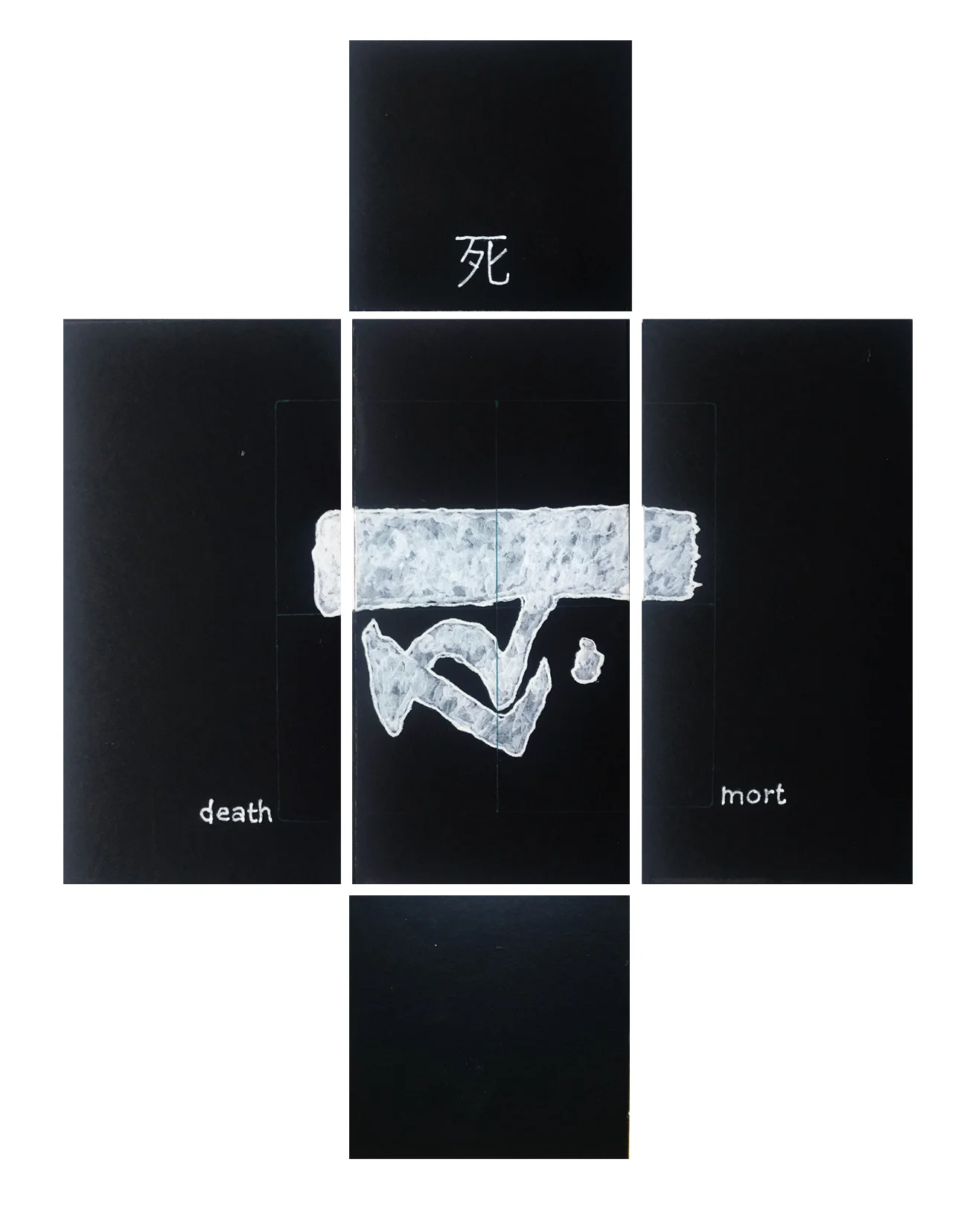
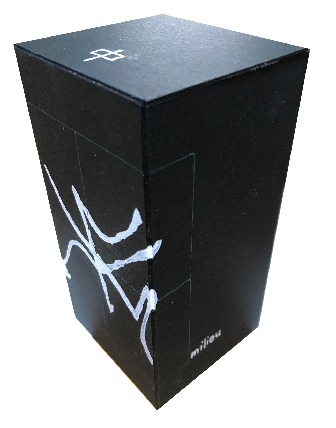
This exhibition was the result of an assignment in the "Design and Expression" Class in the Graphic Design Dept. at Seika University. The theme, "Blind Spot", has two characters in Japanese - 盲点 - and is pronounced 'moten'. 

I used the parts - called radicals - of these two characters as triggers of inspiration for the creative process that ultimately led the photographic montage work called "Life is WOW". 

Intangibly, I interpreted the theme as life because we never really know what will happen next. Like an invisible moving object heading towards us with positive or negative energy, life hides an infinite quantities of surprises. From the get-go the desire to transmit depth and infinity was part of the plan.

By looking at the kanji and their parts we have: 

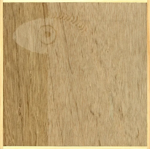
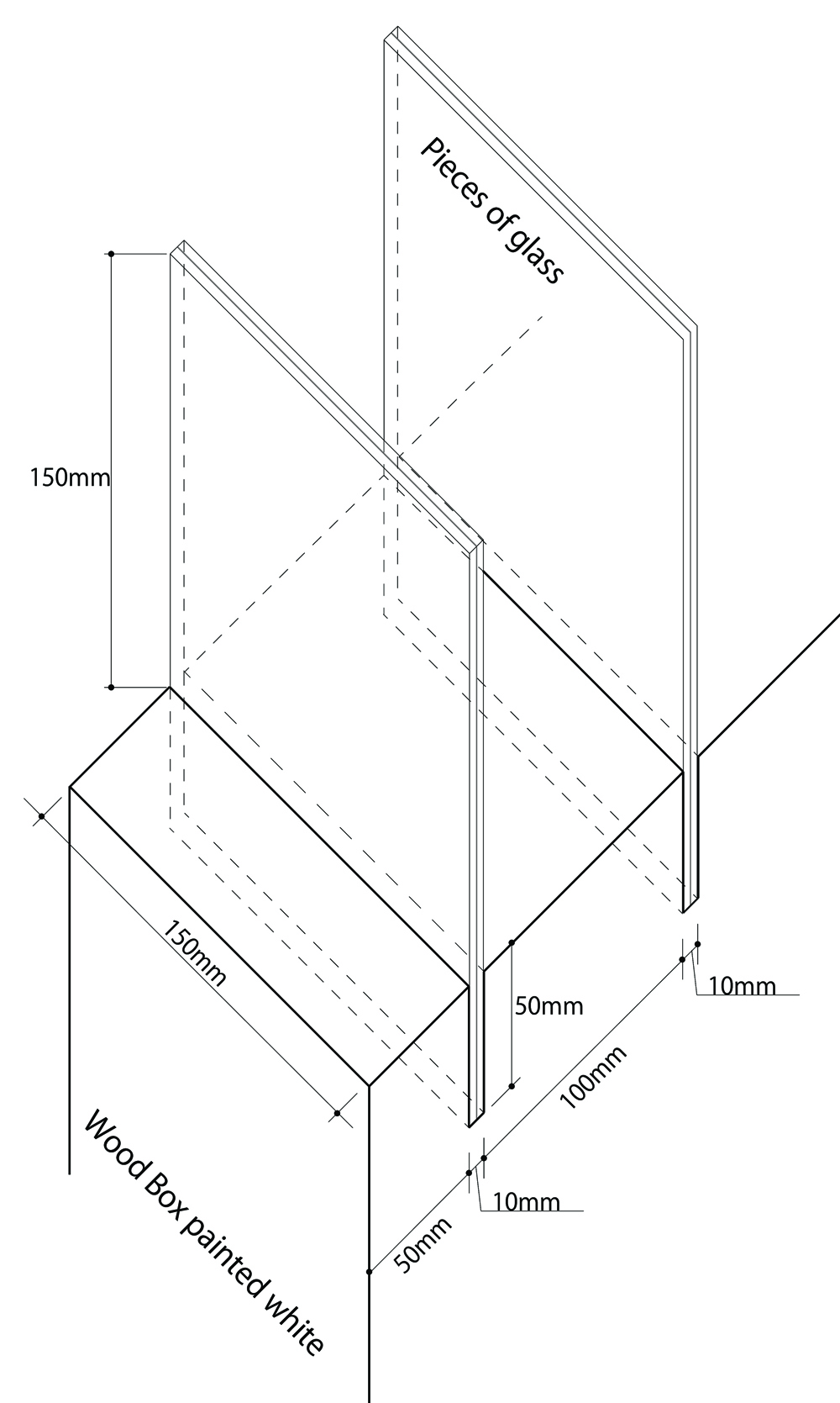
Blind: 盲:亡+目. The first means "the deceased, the late, perish" and is a depiction of a human shape hidden behind a semi-transparent cloth or partition. From this I gathered the idea of the "see-through-barrier". The second part is a depiction of an eye, which long ago was written horizontally. Like the eye, with the white-color-white parts that character showed three parts (or a stack of three rectangles as we see it now). Thus, from the character " blind", with its parts I wanted to use an "eye-see-through-mesh" in the work. This became the 3D glasses that are needed to see some specific shapes in the montage.

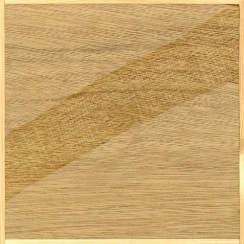
Spot: 点:占+火. The first part is the character used to represent fortune telling. It's seems that the Chinese, in the olden days, looked at cracks in tortoise shells to understand what the gods were saying. From this I took the "mysterious, mystic, unknown" idea. The second part, illustrated by 4 strokes at the bottom of the character "spot-点", represents fire (火). From this the use of warm color tones came about.

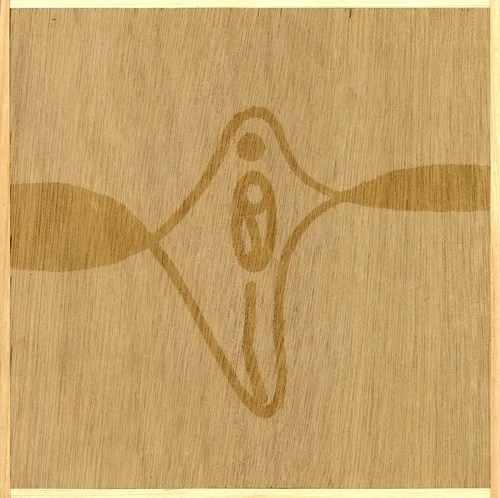
All these ideas are woven in the montage showing three Japanese Braille letters, which are "i", "no", "chi" meaning "life". They can be seen with 3D glasses as they sublely and inconspicuously pop out from the background horizon of the canvas. This mysterious message, as most people don't read braille, could be read by touching the three hiragana letters "i", "no", "chi" - written with hot glue and became embossed - behind the bottom right white panel.

Yamamoto Gallery Facade
Parts of the Japanese characters 盲点 meaning Blind Spot:

Blind: 盲:亡(dead)+目(eye) ; Spot: 点:占(fortune telling)+火(fire)

"Life is WOW" photomontage

Also included are 3D glasses and a hidden embossed message

Kihara Pharmacy Logo Proposals

Kihara Pharmacy, a family owned business, was looking for a new logo and a new brand name.

The first three proposals relate to their name "Kihara" and the developed designs are derived from the meaning and origins of the Japanese characters "Ki" (木 - tree) and "hara" (原 - source). These inspirations are tied in with the "K" shape, which would have given the name "K" or "ke-i" as pronounced in Japanese.

The next two "plus" sign proposals reflect a common street sign identity for  drugstore owners in Japan. However, I offered them variations relating to pill shapes. The name "Plus" would have been very positive as Japanese use this English word in their daily lives.

The last proposal was a derived variation of the pill shape blended with a modified version of a heavily used "emoticon" in Japanese phone communications. This mark also reflects, to some extent, the Japanese "kawaii" (cute) culture. 

For logistical & financial reasons, the owners never had a chance to buy and use a design but they were especially pleased with the last one. They thought it would have given them a chance to positively connect with young families of the neighbourhood, a consequence of recent residential developments of the surroundings. 

KiharaLogo2.jpg
KiharaLogo3.jpg
KiharaLogo4.jpg
KiharaLogo5.jpg
KiharaLogo6.jpg
KiharaLogo7.jpg
prev / next
Back to Creative Research
2
Muko City Manhole Cover Contest
Visual Identity of Exhibition
26
Black Blank; Visual Design
PGF_Logo-02.jpg
2
PGF Logo
Detail2.jpg
35
Kanji vs Kanji Solo Exhibition: "The Suspension" - A Visual Poem
MicroMvt17_Thumbnail.jpg
17
Kanji vs Kanji: Micro-Movement Series; Silkscreen prints
Layout at the exhibition
4
Master's Graduation Works: Silkscreen Print Series
Gel5.jpg
8
Master's Graduation Works: Installation
ExhibitPoster_LowRez_Thumbnail.jpg
3
Blind Spot Group Exhibition
KiharaLogo2.jpg
6
Kihara Pharmacy Logo Proposals