• Creative Research
  • Graphic Design & Photography
  • Manhole Covers
  • Shop
  • About
  • Student Works
Menu

AGRAPH 3

AGRAPH 3
•
agraph3@gmail.com

Your Custom Text Here

AGRAPH 3

  • Creative Research
  • Graphic Design & Photography
  • Manhole Covers
  • Shop
  • About
  • Student Works

Antipodes: Wabi Sabi vs Technology; Photography

In 2008, after my first year of living in Japan, I made a solo photography exhibition in Montreal exposing my first impressions of the country. At that time, the exhibition’s introduction caption at the entrance, written in French, transmitted some of those impressions. Basically, this introduction was in the format of a conversation I had a couple of months earlier with a friend of mine, Peggy Bédard, who was asking me questions about the concept of the exhibition. Hereafter, are some passages of our conversation.

P.B. What struck you in Japan? What oriented your exhibition?

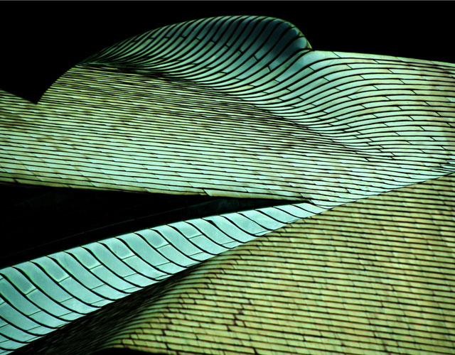
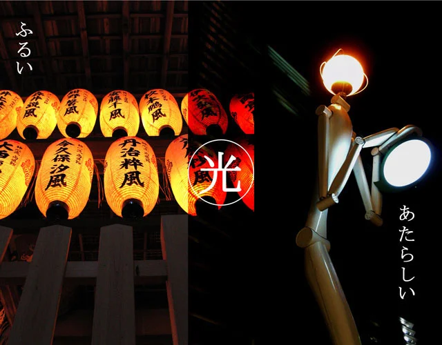
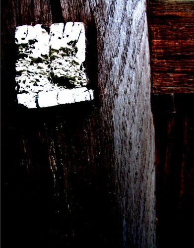
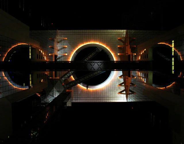
J.S.M. Beyond the extremely difficult language and the multitude of refined customs, what really made a strong impression on me was how extremes cohabit so close together. One example of this is the flyer I’m making for the event: a picture of a highly modern building built right next to an old rustic Buddhist temple. This opposition is the core of this exhibition. I called it “Antipodes: Wabi Sabi vs Technology”.

P.B. Why “Antipodes”?

J.S.M. Because there are many daily life examples that I came across here which illustrate just that. For example: Fried food is everywhere but Japanese are thin; the Japanese work insane hours every week but have one of the world’s longest life expentancy; there are special ground tiles for the blind but there are, although not always, many places where guard rails are absent in dangerous public places; ATM machines can count coins but my new telephone isn’t even touch tone; kimonos and modern wear coexist; you can have a ticket if you smoke at some outside designated places but it is ok to smoke inside (…) and finally a wrapping within a wrapping within another wrapping is a normal non-ecological habit but the Kyoto treaty was signed here, also, people take long rests even sleep in their engine running cars at convenient store but on the other hand, most buses turn off their engines at every red light.

P.B. What kind of “antipodes” will you expose?

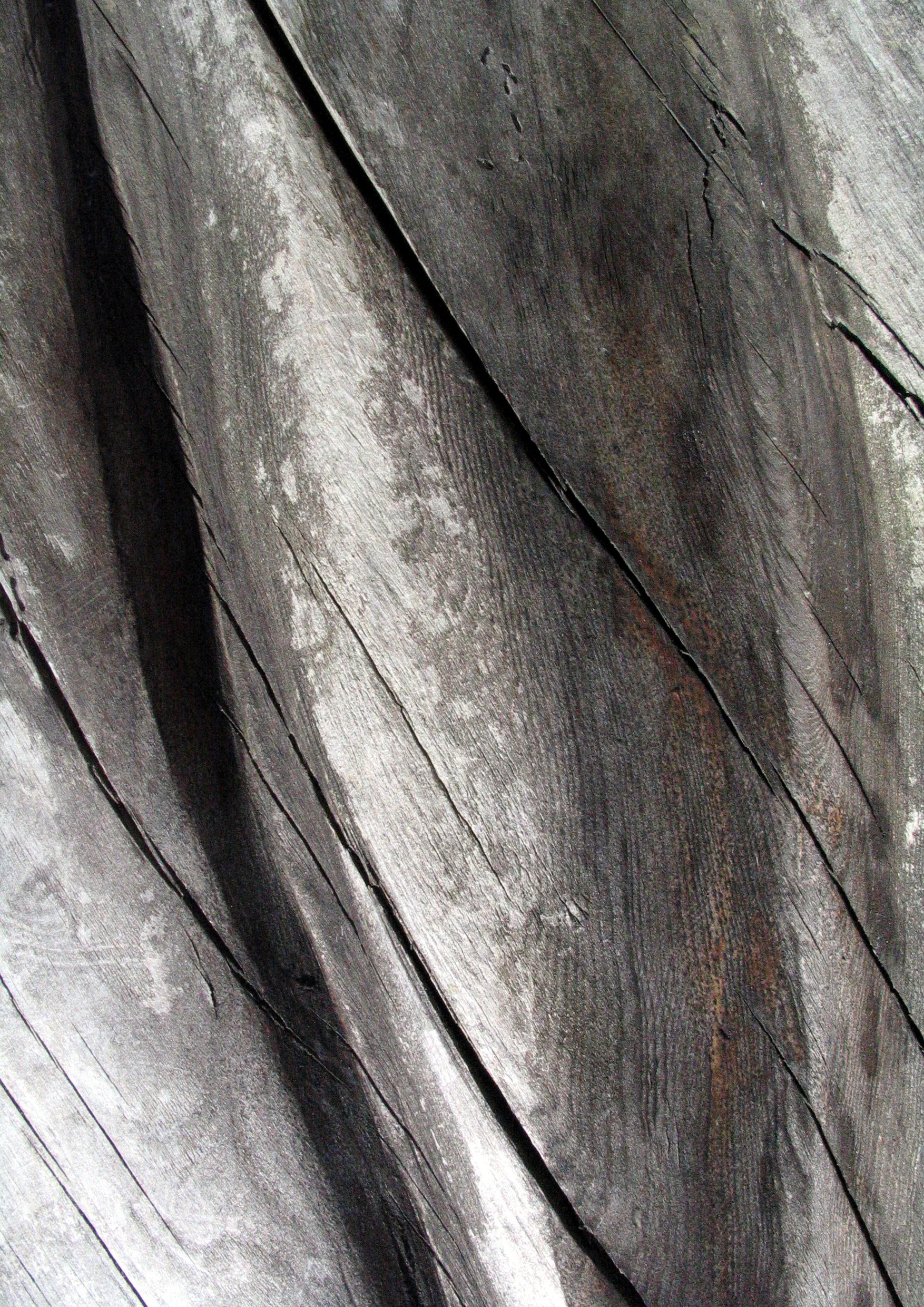
J.S.M. The extremes that I will be showing are called Wabi Sabi and Technology oriented towards architecture and textures. By technology I mean technical advances in the field of architecture and its flamboyant Japanese designs. This will, in contrast, be opposed to the subtle beauty of the action of time on rustic wooden materials or on metal rusted surfaces. In his book Wabi Sabi : for Artists, Designers, Poets & Philosophers, Leonard Koren reveals the contrasts of modernity and the Wabi Sabi frame of mind. Hereafter are examples of the former vs the latter: future oriented vs present oriented; man made materials vs natural materials; cool vs warm; perfect materiality vs imperfect materiality; ostensibly slick vs ostensibly crude (…) and modernity is intolerant towards ambiguity vs Wabi Sabi which is comfortable with ambiguity and contradiction.

High Rise Curved - Tokyo / 41.3cm x 32.2cm
A Simple Look - Uji / 41.3cm x 32.2cm
Autumn Pond - Mount Koya / 32.2cm x 41.3cm
Campari - Tokyo / 41.3cm x 32.2cm
Red Rhythm - Kyoto / 32.2cm x 41.3cm
Wave - Osaka / 32.2cm x 41.3cm
Metal Bamboo - Kyoto (Photomontage) / 32.2cm x 41.3cm
Patina - Kyoto / 32.2cm x 41.3cm
Mizu(Water) - Kyotanabe (Long exposure photo) / 41.3cm x 32.2cm
Hi(Fire) - Kyotanabe (Long exposure photo) / 41.3cm x 32.2cm
Hikari(light) - Kyoto&Osaka (Photomontage) / 32.2cm x 41.3cm
Ki No Kami Sama(god of wood) - Nara (Photomontage) / 32.2cm x 41.3cm
Color of Time - Kyoto / 41.3cm x 32.2cm
Spark - Onomichi / 41.3cm x 32.2cm
Zen - Mount Koya / 41.3cm x 32.2cm
Humble Perspective - Kyoto / 32.2cm x 41.3cm
Pink Gruyere - Tokyo / 41.3cm x 32.2cm
Lung - Tokyo / 41.3cm x 32.2cm
Stamp - Kyoto / 41.3cm x 32.2cm
Comet - Onomichi / 41.3cm x 32.2cm
Blue Squares Red Circles - Osaka / 32.2cm x 41.3cm
Rings of Fire - Osaka / 32.2cm x 41.3cm
Gates - Onomichi (Photomontage) / 32.2cm x 41.3cm
Reflections to Past - Uji / 32.2cm x 41.3cm
New Sound of Tokyo - Tokyo / 32.2cm x 41.3cm
Blue Spine - Tokyo / 41.3cm x 32.2cm
Hana(Flower) - Kyotanabe(Long exposure photo) / 41.3cm x 32.2cm
Derrière la flamme de Starck - Tokyo / 41.3cm x 32.2cm
Future - Tokyo / 41.3cm x 32.2cm
Kamo Gawa - Kyoto / 41.3cm x 32.2cm

Kanji vs Kanji: Liquid Moment Series; Photography

This is part of the Kanji vs Kanji exhibition. ( Here Kanji, writtent: 感じ-" means feeling" or "instinctive") . It is a a photo series which explores the «spur of the moment» of mixing watercolor and black ink while in the act of painting. Isolating moments of time when these two liquids are merging together reveal authentic ephemeral patterns.

20130618-171140 / 19.cm x 27.7cm
20130618-173728 / 19.cm x 27.7cm
20130703-113627 / 19.cm x 27.7cm
20130703-120331 / 19.cm x 27.7cm
20131001-184235 / 19.cm x 27.7cm
20131211-165727 / 19.cm x 27.7cm
20140103-125851 / 19.cm x 27.7cm
20140103-133232 / 19.cm x 27.7cm
20140103-133240 / 19.cm x 27.7cm
20140103-133255 / 19.cm x 27.7cm
20140103-133310 / 19.cm x 27.7cm
20140103-142225 / 19.cm x 27.7cm

Tokyo Olympic Emblems

The outer lines evoke world connections and the vibrant energy of world class sports. As athletes endlessly practice, these emblems express the ups and downs, the day in day out efforts for self-surpassment. Inner lines symbolise human shapes with hands oriented skyward all converging to the middle evoking mutual respect and cooperation between athletes, coaches and supporters. The color palette was chosen to reflect the warm hospitality of Japanese people and the magnificent nature of their land. 

EmblemDesignProposal.jpg
DesignDevProposal.jpg

Master's Graduation Works: Design with Taction Book

This one-hundred page book contains my personal history regarding Wabi Sabi and Japan, traces of sketches, translations into French and English of the Japanese characters – kanji – etymology used for the graduation works and the numerous visual experiences & two installation designs produced during the Masters Visual Design course. Both covers are silk-screen prints on black thick Canson board and the binding is a handmade Japanese technique.

Front Cover
Front Cover
Back Cover
Back Cover
DetailBack2.jpg
DetailFront2.jpg
Inside.jpg
p00.jpg
p01.jpg
p2-3.jpg
p28-29.jpg
p30-31.jpg
p32-33.jpg
p60-61.jpg
p70-71.jpg
p100-101.jpg

Peer Selected Logo - Kyoto Seika University

This logo, selected from a Master's students'contest, was the identity for Kyoto Seika University's 2013 Master's Graduation Exhibition. It represents an exclamation mark composed of the various colours - departments - of the university. I subsequently led a design team to create the poster, the flyer/postcard, the artist list as well as a bookmark for visitors coming to the event. Together we coordinated budget with the university and the outsourced printing production.

Poster, B2 Size
Poster, B2 Size
Postcard (Front & Back)
Artist List (Front & Back), A4 Size

Yoga Instructor Identity

Chie Yamada works as a yoga instructor and wanted to have an original identity that stood out so I decided to reverse common visual narratives regarding yoga. Instead of choosing an ocean and sunset, I proposed to put emphasis on the power of yoga to stop "traffic stress". However, we did shoot some pictures along Kyoto's Kamo river. Later in the process, I invented the slogan "stop and be" with which a combination of a black & white background emphasised "Stop". This, at a first degree of thought, represents the literal physical stoppage of the body. On a more abstract level, green evokes the permission to reconnect with one's inner self and allows body & mind energy circulation. 

FINAL_Front_lwrz.jpg
FINAL_BAck_lwrz.jpg
Kamo River Photo Shoot

Staple Katakana 46 Typeface

Staple translates to agrafe in french - my mother tongue - and, as explained in the 'About' section, is the origin of the homophone and freelance name AGRAPH. The initial intention was the union of three fields together: Architecture, Graphic design and Photography. Agraph 3 started in 2005 but it wasn't until 2011 that the first drafts of the Staple typeface were made with real staples. As part of the Master's graphic design research at Kyoto Seika University, I constructed the 46 basic katakana letter syllabary which was then scanned and tweaked in illustrator before being sent to a company that made metal plates with the font. With these plates I was able to make plaster blocks with letters embedded in them. 

46 Katakana Staple letters
Portion of the Katakana syllabary - Illustrator data
The alphabet and some signs - Illustrator data
Silkscreen print of both syllabaries on staples
Alphabet plate
Alphabet plate
The katakana plate 1
Plaster cubes - Master's first year sculpture

Kanji vs Kanji Exhibition Graphic Design

As described in the Kanji vs Kanji Solo Exhibition project in the Art Exhibition section, this show was a two part exhibition that represented the duality Kanji 感じ (instinct, feeling) vs Kanji 漢字 (Japanese character). The former materialised into two series: The Liquid Moment Series and the Micro-movement Series. The latter was a dream transposed to a visual poem which was developed with Japanese character etymology. These three series were presented during the PhD course at Kyoto Seika University.

Flyer (Front-Back)
Flyer (Front-Back)
Micro-movement Series Postcard (Front-Back)
"Suspension" Series Postcard (Front-Back)
Liquid Moment Series Postcard (Front-Back)
"Suspension" Series Postcard (Front-Back)
Visitor's handout (English side), A4 size
Visitor's handout (Japanese side), A4 size

Peer Selected - One Top Logo

Montreal's Belgo Building based SAS gallery organised a logo on T-shirt competition which was held every year with various themes. Each participant could submit 3 designs and 20 winners were selected from hundreds of designs. These 20 designs were printed on T-shirts and sold in at the gallery and in selected Montreal stores. 2 years in a row my design was peer selected in the winners.

Peer selected 2006 Logo; Theme: The Couple
The Couple: Submitted design
Peer selected 2007 Logo; Theme: The Environment
The Environment: Submitted design

Logo: The earth is deteriorating rapidly

Need glasses? 

The Environment: Submitted design
2008 Theme: Design; Submitted design
2008 Theme: Design; unsubmitted design

MaudZilla Identity

Logo mark created for entrepreneur Maude Charest, event manager and P.R. representative. Montreal, Canada.

Logo Mark
Logo Mark
Proposition 1
Proposition 1
Proposition 2
Proposition 2
Proposition 3
Proposition 3

PlayList Logo

This Rimouski based rock band plays old rock songs as well as recent hits. They wanted a contemporary identity but with a vintage twist to its look. The bold and original typeface surrounded with an old cassette reel is easily recognizable and easy to recognize even from the back of venues where they play.

Final Logo
Final Logo
Other Proposal
Other Proposal
Other Proposal
Other Proposal
Sketch
Sketch

A Mari Usque Ad Mare - Photography Group Exhibition

I recruited Canadians from the Kansai area and organised a group exhibition on Canada at Kyoto's International Community House situated in the Higashiyama area. The theme of the exhibition was Canada's motto "Ad Mari Usque Ad Mare" meaning "From one ocean to the other". This theme became the concept of the exhibit: From a picture to its thoughts. Therefore, each participating member had to expose a photo of Canada and write their own thoughts of it on the caption in the form of a poem, quote or just simple prose. I designed the room layout, materialised the concept and curated the work sequences as well as coordinated the opening. Visitors could write comments about a picture on a piece of red light cardboard located below the work. This red cardboard was one part of a long dotted line pointing at the two oceans between which Canada is located. These two oceans were represented in the exhibition space with blue cardboard paper dented by hand on which the Japanese characters of "Pacific Ocean" and "Atlantic Ocean" were written.   

Poster.jpg
PhotoAtExhibitPart1.jpg
PhotoAtExhibitPart2.jpg
Music Score, A3 size

"Everybody needs some harmony and rhythm." - Plato

Haida
Haida

"All things must die, and great art must be a living thing or it is not art at all." - Bill Reid, Canadian artist (1920-1998)

Wood Flow, A3 size
Wood Flow, A3 size

"Leave the beaten track behind occasionally and dive into the woods. Every time you do you will be certain to find something you have never seen before." - Alexander Graham Bell

Sunset, photomontage, A3 size

"Character, like a photograph, develops in darkness." - Yousuf Karsh,                                                  Turkish born Canadian photographer and journalist (1908 -2002 )

Old New, A3 size
Old New, A3 size

Stones to steel. Absorption, reflection. Darkness to light. Action, reaction. Montreal city old. Montreal city new.

Diverse scope.

prev / next
Back to Graphic Design & Photography
High Rise Curved - Tokyo / 41.3cm x 32.2cm
30
Antipodes: Wabi Sabi vs Technology; Photography
20130703-113627_thumbnail.jpg
12
Kanji vs Kanji: Liquid Moment Series; Photography
EmblemBanner.jpg
2
Tokyo Olympic Emblems
Front Cover
14
Master's Graduation Works: Design with Taction Book
LogoBanner_square2.jpg
3
Peer Selected Logo - Kyoto Seika University
5
Yoga Instructor Identity
R.jpg
7
Staple Katakana 46 Typeface
DM_lowrez_表.jpg
7
Kanji vs Kanji Exhibition Graphic Design
Peer selected 2006 Logo; Theme: The Couple
11
Peer Selected - One Top Logo
MaudZilla_Logo_FINAL.jpg
4
MaudZilla Identity
Final Logo
4
PlayList Logo
Banner1.jpg
8
A Mari Usque Ad Mare - Photography Group Exhibition