


Your Custom Text Here
Kihara Pharmacy, a family owned business, was looking for a new logo and a new brand name.
The first three proposals relate to their name "Kihara" and the developed designs are derived from the meaning and origins of the Japanese characters "Ki" (木 - tree) and "hara" (原 - source). These inspirations are tied in with the "K" shape, which would have given the name "K" or "ke-i" as pronounced in Japanese.
The next two "plus" sign proposals reflect a common street sign identity for drugstore owners in Japan. However, I offered them variations relating to pill shapes. The name "Plus" would have been very positive as Japanese use this English word in their daily lives.
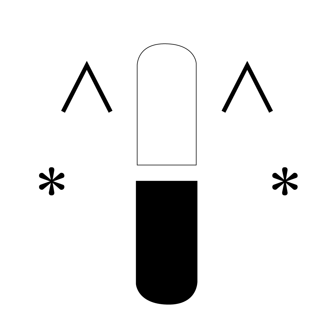
The last proposal was a derived variation of the pill shape blended with a modified version of a heavily used "emoticon" in Japanese phone communications. This mark also reflects, to some extent, the Japanese "kawaii" (cute) culture.
For logistical & financial reasons, the owners never had a chance to buy and use a design but they were especially pleased with the last one. They thought it would have given them a chance to positively connect with young families of the neighbourhood, a consequence of recent residential developments of the surroundings.
Kihara Pharmacy, a family owned business, was looking for a new logo and a new brand name.
The first three proposals relate to their name "Kihara" and the developed designs are derived from the meaning and origins of the Japanese characters "Ki" (木 - tree) and "hara" (原 - source). These inspirations are tied in with the "K" shape, which would have given the name "K" or "ke-i" as pronounced in Japanese.
The next two "plus" sign proposals reflect a common street sign identity for drugstore owners in Japan. However, I offered them variations relating to pill shapes. The name "Plus" would have been very positive as Japanese use this English word in their daily lives.
The last proposal was a derived variation of the pill shape blended with a modified version of a heavily used "emoticon" in Japanese phone communications. This mark also reflects, to some extent, the Japanese "kawaii" (cute) culture.
For logistical & financial reasons, the owners never had a chance to buy and use a design but they were especially pleased with the last one. They thought it would have given them a chance to positively connect with young families of the neighbourhood, a consequence of recent residential developments of the surroundings.